I am a big fan of examples. Not a surprise, right? If you follow me on Twitter, or my projects over the last few years (or asked D3 questions on Stack Overflow), you’ve likely seen some of my example visualizations, maps and explanations.
I use examples so often that I created bl.ocks.org to make it easier for me to share them. It lets you quickly post code and share examples with a short URL. Your code is displayed below; it’s view source by default. And it’s backed by GitHub Gist, so examples have a git repository for version control, and are forkable, cloneable and commentable.
I initially conceived this talk as an excuse to show all my examples. But with more than 600, I’d have only 4.5 seconds per slide. A bit overwhelming. So instead I’ve picked a few favorites that I hope you’ll enjoy. You should find this talk entertaining, even if it fails to be insightful.
This talk does have a point, though. Examples are lightweight and informal; they can often be made in a few minutes; they lack the ceremony of polished graphics or official tools. Yet examples are a powerful medium of communication that is capable of expressing big ideas with immediate impact. And Eyeo is a unique opportunity for me to talk directly to all of you that are doing amazing things with code, data and visualization. So, if I can accomplish one thing here, it should be to get you to share more examples. In short, to share my love of examples with you.
So let’s start with an example, shall we? (Note: an example of an example, or meta-example.) This is one of my favorites, but it’s also flawed in a way that is representative, making it a good candidate for dissection.
Jason Davies and I created this to demonstrate a new feature in D3 3.0’s geographic projection system.
One challenge in map projection is that input geometry—coast lines, country borders and such—are defined as polygons. When polygons are flattened from the sphere to the screen, the edges may become curves due to distortion in the projection. And the fact that edges are not straight lines to begin with: spherical polygon edges are great arcs. The left shows what happens if you represent the equator as a polyline with a point every 90°. When projected point-by-point, the line appears broken because five points are not enough to produce a smooth curve.
The conventional fix is to use more points. The middle diagram shows a point every 4° of longitude. This is obviously better. But if you look closely, you can still see artifacts on the vertical lines where the distortion is so severe that even 4° is not enough! And you can see many points along the horizontal lines where there is little distortion; these points do not improve quality, but slow down rendering. So uniform resampling is inefficient and doesn’t guarantee great results.
Our solution is on the right. We detect places of high curvature and introduce additional points just in those places. This gives beautiful results even in areas of high distortion, and performs well because we only add points where they are needed.
Now, I said this example was flawed. If I weren’t now explaining it, you could easily be scratching your head, wondering what you were looking at. Not every viewer will be sufficiently familiar with map projections to understand the problem or the proposed solution. So obviously the first step in any example is to know your audience and communicate in a way that is accessible to them.
So what are we looking at?
The gray lines of constant latitude and longitude, called parallels and meridians, form a spherical grid called a graticule. The red parallel bisecting this spherical grid at 0° latitude is the equator.
Then we took the sphere and flattened it down to the plane with our map projection. Specifically, the equirectangular or plate carrée projection, which is the simplest type of projection there is. Longitude runs along the x-axis and latitude along the y-axis.
In the normal aspect of the equirectangular projection—that is, without any rotation—the equator is a straight line. But now we rotate the sphere counterclockwise by almost 90° along one axis, while rotating the display clockwise by 90° so that the poles remain vertically aligned. This type of rotation is called the transverse aspect.
The transverse aspect of the equirectangular projection has another special name: the Cassini projection. There’s not much use for this projection today, as it has been largely replaced by the transverse Mercator for low-distortion maps of narrow regions. I used the Cassini projection in this example only because it bends the equator and is easy to fit thrice side-by-side.
César-François Cassini de Thury was a French cartographer and astronomer, and the grandson of Giovanni Domenico Cassini, who first observed Saturn’s moons and the division in Saturn’s rings. This isn’t relevant to understanding the example, but I’m mentioning it anyway because the history of cartography is fascinating, and map projections are so numerous and beautiful. It’s difficult to imagine individuals inventing projections with pen and paper in a time before computers, when graticules were essential to drawing cartographic boundaries accurately by hand.
With the above explanation, you can now see what adaptive resampling does. But how does it work?
The algorithm recursively subdivides the input polygon. Each adjacent pair of points forms a great arc segment. The algorithm computes the midpoint of this great arc and projects it; these midpoints are shown in black. Then it measures the perpendicular distance from the midpoint to the straight line between the two arc endpoints; these distances are shown as black lines, and provide an estimate of curvature.
If the perpendicular distance is large, then the edge has high curvature and it’s beneficial to resample. On the other hand if the area is small, then the projected line is approximately straight, so resampling can terminate. Hence the term “adaptive”: only resample where needed.
One of the nice properties of this algorithm is that the curvature estimation is scale-dependent. So as you zoom in, or increase the display size, the perpendicular distances change as the curves change and the algorithm adjusts automatically.
In essence, the resampling algorithm is the reverse of Douglas–Peucker line simplification. Rather than remove detail, it preserves detail that would be lost when projected.
With all that additional context, let’s take a second look.
If you are wondering, the graticules in all three views are rendered with adaptive resampling. This is why all three graticules look good! Remember the graticule is itself a polygon: everything is a polygon! This is done automatically as part of D3’s projection pipeline, but you can customize the accuracy of resampling (a trade-off between quality and speed) using projection.precision.
I think that’s a cool algorithm. It’s neat, right? Particularly the symmetry with line simplification. But I was so excited to tell you how cool the algorithm was, I forgot to explain why it matters. The example illustrates what the feature does, but not why the feature exists. So the example only resonates for viewers that understand the feature’s utility, which is likely only the feature’s author. If you want your example to speak to people other than yourself, you have to remember the why.
We can address this flaw by instead showing concrete applications that the feature enables. Preferably, applications that are representative of real-world needs.
Here is Van der Grinten’s world projection. On the left is without adaptive resampling, and on the right is with. The adaptive resampling removes polygonal artifacts that are visible in Antarctica. These artifacts are caused by a cut in the Antarctica polygon along the date line, or antimeridian. The antimeridian cut extends from the coast of Antarctica at -180° longitude, to the south pole and then back to +180° longitude. With no intermediate points, you get a straight line when projected, which looks bad. But if we resample, we get the nice curve that we expect.
The Larrivée projection also exhibits this problem. It’s ugly unless you resample!
Now a reasonable objection is that these are obscure historical projections, and that I picked them to exaggerate the problem. Perhaps other, more common projections do not suffer from these polygonal artifacts. And this is partly true.
But it is common enough! And one of the worst cases is the Albers equal-area conic projection, a map projection that is frequently used in visualization because it preserves proportionality of areas. Here the distortion is large enough to intersect land masses, causing fill inversion; a visual catastrophe.
With conic projections like Albers, we need many many points of resampling because the curve of Antarctica’s antimeridian cut extends all the way from the left edge to the right edge of the graph. But adaptive resampling is scale-dependent, and so compensates for the length of this curve automatically by adding the necessary points to achieve the desired rendering accuracy.
By showing examples that demonstrate real-world applications of a feature, rather than just proving the existence of the feature, we make a stronger argument. We make it easier for the viewer to imagine incorporating this abstract idea into their own work.
On the other hand, there is a risk when we only show a few sample applications. If they are not representative, then the viewer might speculate alternative solutions. The examples are evidence, not proof; we have to pick strong evidence to make a strong case. A seemingly-reasonable alternatives is the conventional solution: why not just add more detail to Antarctica?
Cartographically speaking, Antarctica is special for two reasons: it crosses the antimeridian and it encompasses a pole. However, these special qualifications are only present in the normal aspect. If you rotate the sphere along longitude and latitude, suddenly any land mass can present this same challenge! [Try this now by touching the above map.] Thus if we ignore the problem of antimeridian cutting, then as soon as we rotate the globe then polygons can cross from one side to the other, causing these horrible artifacts. If you ever wondered why the normal aspect is so entrenched in cartography, it’s not just cultural imperialism—it’s a tricky math problem!
D3 instead cuts the antimeridian after rotation. So D3 doesn’t require precut (or presampled) input. It just works because D3 treats polygons and lines as first-class primitives during geographic projection, avoiding point-based artifacts.
I’ll end this sequence with one of my favorite unusual projections. Allen Philbrick’s interrupted sinu-Mollweide uses the sinusoidal projection for the southern hemisphere and the Mollweide projection for the northern hemisphere. Both hemispheres are interrupted—that is, cut into lobes, reducing distortion on land masses at the expense of the oceans.
I’m not aware of a practical modern use for this projection. But I like that I could use it, if I so desired, or design a specialized interrupted projection of my own. It’s critical to surface the assumptions intrinsic to your tools and data, and the resulting restrictions in expressivity. Attacking those assumptions can dramatically increase your creative freedom.
To sum up: examples are about demonstrating the potential value of ideas. Unlike a published graphic, you don’t have to capture immediate value. You merely present an idea that has potential, in a way that is accessible to your audience. Of course visual tests and explanations are great too. But remember that your goal is to inspire your viewer: make sure the leap from abstract idea to concrete value is a short one.
I hope I haven’t been speaking in a way that only relates to those of you that consider yourself toolmakers, library authors, framework builders, and the like. But if I am, maybe that’s okay; I believe we are all toolmakers, if only for ourselves. You don’t have to be on GitHub to identify tedious tasks and design solutions that makes your process easier, more productive, or more fun. Building tools is the sign of a rational mind.
Broadly speaking, I consider examples an extension of working knowledge: a place to take a small idea I’ve learned during my work, and isolate it; an apothecary capturing some precious essence in a glass jar. Build enough examples and you have a wide repertoire of ideas to apply in any situation.
Best of all, these ideas are inherently composable and customizable, not wrapped in a heavy blanket of abstraction. There is an important role for abstraction, but designing abstractions is difficult. Examples, on the other hand, are easy and flexible. You can dispose of them if you think of something better later. Even if you desire a formal abstraction, a good set of examples are essential for designing it effectively.
To illustrate my process, here are some examples from my work at The New York Times.
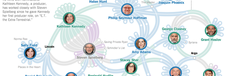
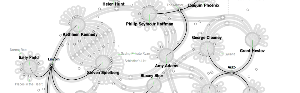
This was a network graphic for the Oscars. It shows the current nominees for the six major awards: four acting awards, best director and best movie. The intent of the graphic was to show the deeply-interconnected nature of the Hollywood A-list, and how success concentrates at the top of the food chain. Just the Spielberg–Kennedy duo, who worked on at least 70 films with Oscar nominations!
The final layout was static, but we initialized the positions using D3’s force layout. We then hand-tweaked the layout to make the curved edges easier to follow (and prettier). This is a luxury we have working with static datasets: we can incorporate manual edits to improve the output of automated layouts. The above image is a screenshot of the internal editor we built for this graphic; after repositioning nodes and labels, or adjusting Bézier control points, you can save the coordinates down to a file that drives the static graphic.
While we did not open-source our editor (it’s specialized to the graphic), I created a sequence of examples on how to roll your own. Starting with brushing, then dragging, this series demonstrates how to build a custom layout editor for node-link diagrams.
We wanted curved links, and my previous force layouts used straight ones. Applying a trick I learned from Ryan Alexander, you can create curved links with a dummy node between each pair of linked nodes. The dummy node serves as a control point for a cubic Bézier; an invisible node, but participating in the force simulation, with repelling charge and momentum. And this small change brings lovely, swoopy links. It’s not a revolution in data visualization, certainly, but now there’s an example you can use for beautiful soft links—particularly useful if you want to hand-tweak those curves later.
Another technique we used in the Oscar graphic was to animate black lines emanating from the highlighted person or film on mouseover. The network is complicated, so a little animation helps to draw your attention to the part of the network under the mouse. Also, like the curved links, it’s fun! I’m not opposed to joy, as long as it doesn’t detract from readability. Even better if it helps!
But there is no API designed to do this, either in SVG or canvas. The obvious solution is a difficult one, to cut the basis spline at any length along the path using de Casteljau’s algorithm. Instead, I hacked SVG’s stroke-dasharray property: instead of using it for static dots or dashes, I animated it to create a single dash along the entire length of the line. This repurposes the API to do something surely unintended, but it works great!
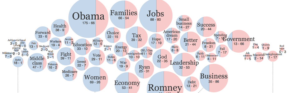
During the national political conventions, we made these word bubbles to compare the speeches of Republicans and Democrats. The graphic is backed by the full transcripts, so you can click on any bubble to read the words in context; this adds a tremendous amount of meaning and addresses a common shortcoming of text visualization, where words are often presented out of context. You can even add new bubbles to the diagram. (Try “Applause” for a laugh.)
Each bubble is sized by the count of occurrences of that word or phrase. But, more interestingly, the bubbles are positioned horizontally according to their partisan bias. So Democrats on the left mentioned "bin Laden" and "Middle class" more often than the Republicans, who favored terms like "unemployment" and "job creators".
We also split the circles to reinforce this bias, showing the relative proportion of Democrat and Republican mentions. Splitting circles into two proportional halves is surprisingly nontrivial: there’s no closed-form solution. Instead you use numeric integration to approximate the answer. It’s the same problem as filling a cylindrical container with water (shown above). For a given k, the fraction of the unit cylinder being filled, you compute the height h of the water’s surface. In the rare event you also have this problem, you can use this example as a reference solution.
And of course word bubbles require collision detection to prevent the bubbles from overlapping. You’ve probably seen this before so I won’t belabor you with an explanation of the algorithm, except to point out that one of the challenges is to detect collisions efficiently. Checking every pair of circles is far too slow. This example uses a quadtree to optimize intersection checks, so it’s fast. And you can just copy-and-paste the relevant code into yours if you need it.
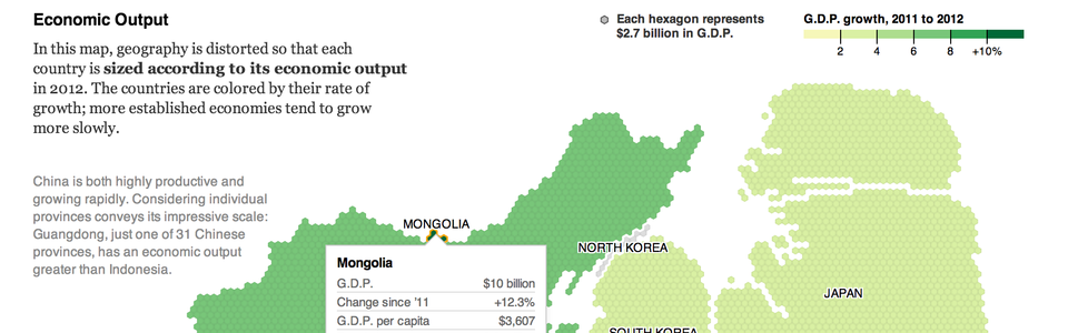
One last graphic before we move on. This is a hexagonal cartogram that compares the GDP of countries in Asia. (Ralph Straumann kindly provided technical guidance for this project.) Each hexagon represents $2.7 billion dollars in annual GDP. Color encodes rate of growth, so you can see how large, mature economies like Japan and South Korea are slowing down. China, of course, is both huge and growing rapidly.
One challenge this graphic presented was taking a set of hexagons assigned to a given country and computing the polygon that encompasses these hexagons. If I draw a bunch of red hexagons, how do I compute the outline? Again, not a truly hard problem, but not a trivial one either. You need an algorithm that can detect which sides of the hexagons are the exterior, and stitch those into a polygon. And detect holes! Fortunately, I had written a similar meshing algorithm for TopoJSON, topojson.mesh, so I simply repurposed it here.
Another reusable component from this graphic was this color key, which was modeled after Ford Fessenden’s map, “In Some Parts of the City, a Common Police Practice”. I love this key because it redundantly encodes the data value—the percentage of stops that involved force—with position as well as color. The full range of the key goes from 0 to 100%, and the thresholds are positioned according to their value.
Very often designers use arbitrary breaks in color encodings to improve contrast; so, having a key like this is essential to rapid understanding. You can see whether the colors are regularly or irregularly spaced. D3 doesn’t provide a color key component, so this is a convenient example to show how to make one.
You’ve now seen a variety of examples derived from published graphics. Some of the examples were useful, some just for fun. That’s fine. Not every example can be a winner. Examples are lightweight and informal. Just look for hidden gems of inspiration in your work, little things that might be repurposed. If you can think of ways to generalize it, then great! But don’t generalize prematurely. There should be a low bar to sharing.
Even if you decide not to publicly share your example, it’s useful to build a collection of simple patterns that you can employ in future work, while the ideas are still fresh in your mind.
In this last section, I’ll show a sequence of examples done by multiple authors to convey how the rapid transmission of ideas enables creativity.
Mike Migurski has been doing some great work making OpenStreetMap vector data more easily accessible. He started, I’m not sure when, ages ago, making parts of the OSM database available as convenient metro extracts for large cities, so that you don’t have to download the multi-gigabyte whole-planet file. Now he’s made a further leap forward by making the OpenStreetMap data accessible in tile format, so that you can easily request vector data for any slice of the world, not limited to major cities. The adoption of vector tiles is exciting because it enables dynamic cartography in the browser—you have tremendous flexibility in how you display the data.
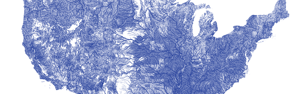
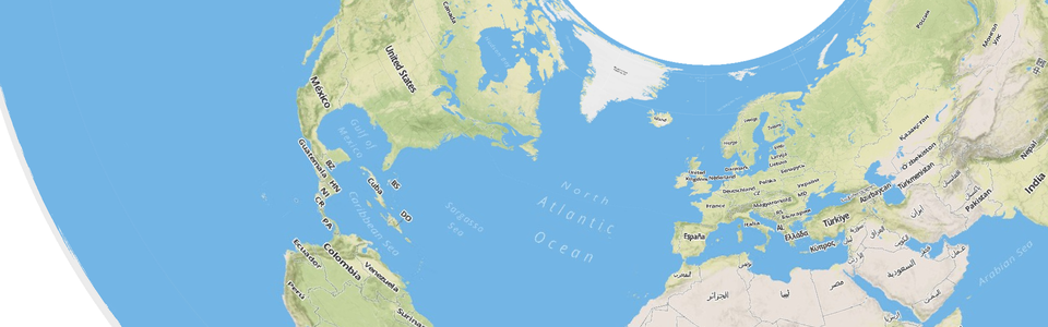
Nelson Minar follows Mike’s work and wrote a tutorial for building vector tiles from NHDPlus, a massive dataset of all the rivers, streams, canals and waterways in the United States. Partly as a test that he was processing the data correctly, and partly inspired by Ben Fry’s “All Streets”, Nelson created this map of the entire U.S.
I saw this, and thought it was beautiful, and since it was such a large dataset, a fun challenge to recreate. And naturally I had to fix that Mercator projection. So I followed Nelson’s tutorial and created my own version using the Albers projection.

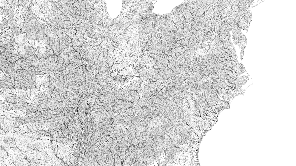
The detail in this dataset is staggeringly beautiful. It’s almost an inverse topographic map: instead of hill shading you have lines of varying thickness in the different basins. The vertical striations of the Appalachians are easily readable in this crop.
But remember this started with vector tiles. And the vector tiles are in the Mercator projection. It’s much harder to take Mercator tiles and reproject them to a different projection because you don’t know which tiles are visible.
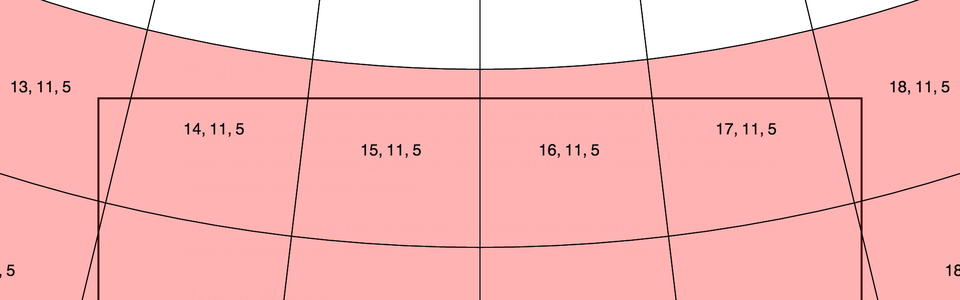
Hard problems like this are Jason Davies’ bread and butter. Jason saw the above examples and set out to determine which tiles would be visible in an arbitrary projection. He then created the above visual demonstration of his algorithm. The red tiles are the ones that are visible, and as you zoom in and out, you can see it recalculate the set of needed tiles instantly.
Naturally Jason didn’t stop there. He combined his new algorithm with an earlier example of raster reprojection, and reprojected raster terrain tiles from MapBox!
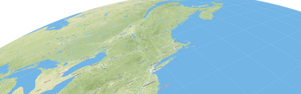
The amazing thing is that this works with any projection—it just recursively traverses the tile quadtree and does intersection checks with the viewport. So it’s fast and flexible! To demonstrate this flexibility, Jason created the above beautiful view of the Eastern seaboard from four hundred miles above the Earth using D3’s satellite projection. (See also his “Mollweide Watercolour” and “Interrupted Goode Raster” examples.)
Taken collectively, these examples are so impressive because they demonstrate how to adapt existing tile data sources (which are all in Mercator) to any map projection. We have the convenience of tiles without the tyranny of Mercator. These are truly exciting times for web cartography. And I believe this advancement was at least partly fostered by rapidly sharing ideas through little examples. Just planting a seed and watching it grow.
Well, here we are at the end. I hope you enjoyed the tour. I endeavored to present a wide gamut—to illustrate the variety of roles that examples can serve, whether visual explanation, demonstration of capabilities, or idea conveniently packaged for reuse. Above all, I hope that you look for little gems in your work that you can share with others. I can’t wait to see what you come up with.
Thank you!